I am so grateful for all the lovely support we have had from our supporters who have given their time freely to help us to improve our application.
I sent out a request for help to a number of people; I didn't think that anyone would have time and quite frankly, I didn't think that they would be interested in giving feedback on software. Everyone said that they enjoyed the session, they certainly were very engaged with the application.
The feedback was very informative and helped us to hone down on the key areas that need improvement. Although everyone approaches software in a slightly different way, you can see patterns in the feedback.

All software aims to be intuitive and this is the challenge. Getting feedback is the best way to understand what works and what does not. Sounds obvious, but it is so easy to feel the pressure to get the application built that sometimes you can miss this opportunity. Ideally, you want to have a clean and simple application that doesn't require users to keep accessing the help to remind them how to use it.
- Keep the interface clean: don't clog it up with lots of buttons and text
- Visual cues are quicker to digest
Here are some fo the interesting things that I observed:
Reading text
When an icon or button needs some supporting explanatory text, how much of that is read? Now I'm unquestionably guilty of virtually never reading instructions; yet I complain when others ignore them! I noticed that my volunteers are much better at reading these than I. However, what is interesting is:
- do they read all the words?
- are the words interpreted differently?
For example...
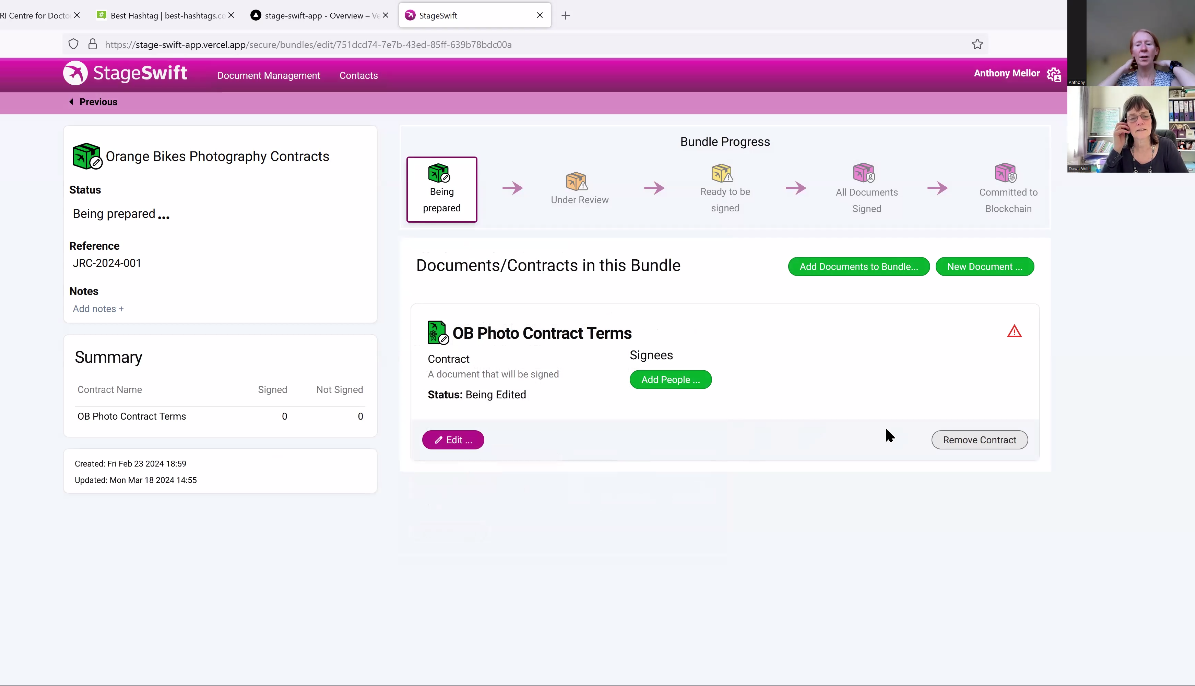
"To share a document or contract it needs to be put into a bundle."
This piece of information is almost immediately forgotten.
Interpretation of words: e.g.
The status of "Under Review": this is meant to indicate that the items in question are being reviewed by the person that they are sent to. However, most people think that an item that is under review would mean one that was being considered by someone in their organisation before it gets approved to be sent out.
Sign posting
How do you make something stand out as being the next most important thing to do?
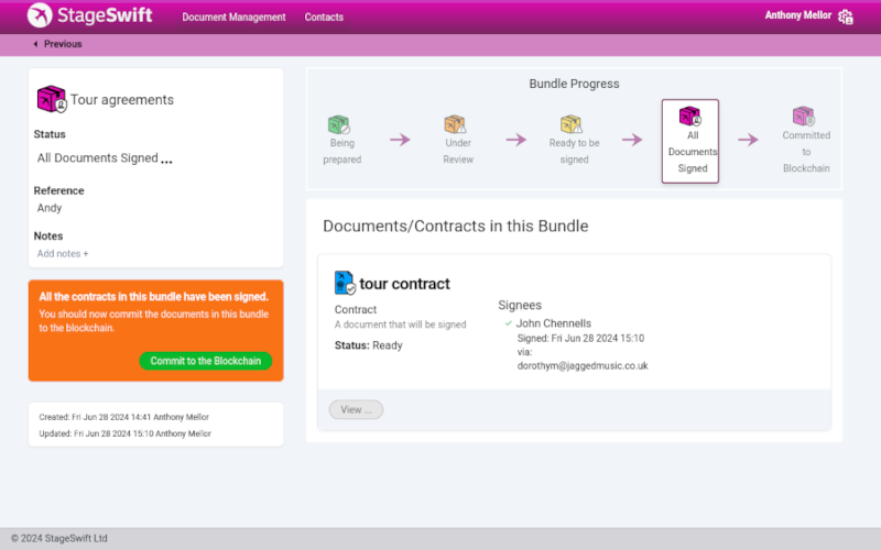
On one page we put the next step in a bright orange panel with a green button. Don't worry, these colours were never intended to be used in the final version, the colouration was yet to be decided. However, this did make the panel stick out like a sore thumb!
Interestingly, a number of people testing the system completely blocked this panel out; they didn't notice it at all until I pointed it out to them. They were extremely surprised that they hadn't considered looking at it, much to everyone's amusement.

It is normal to block out things that are "irrelevant" to the task at hand so this panel was obviously not where they were focussing, it was in the wrong position even though it was very prominent.
Previous experience
Obviously, someone who spends a large amount of time using business applications will experience software differently to those who are infrequent users. Some people remarked that they didn't know where their document had "gone" whereas others intuitively new where to look for it without any help.
